HonestUI
(2026)
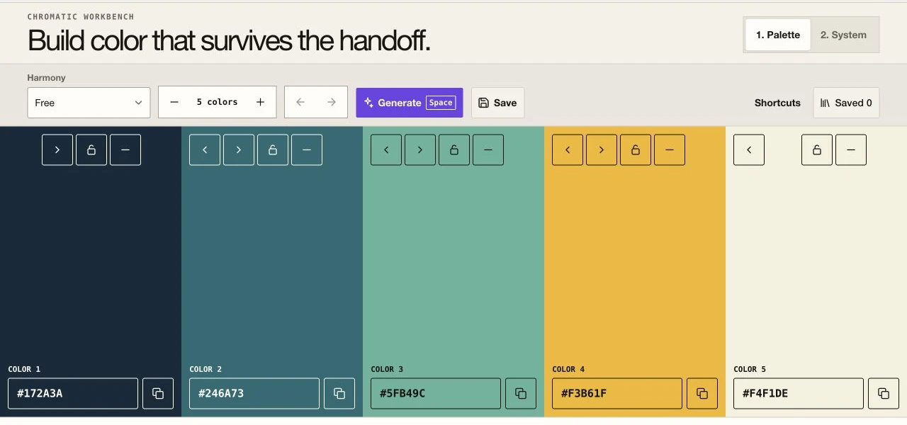
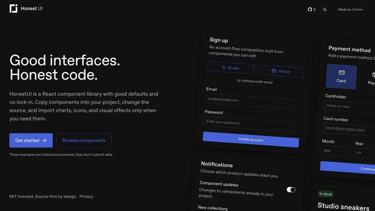
HonestUI is a React component library with good defaults and no lock-in.
Developers can copy UI components into a project, edit the source directly, and import charts, icons, or visual effects only when they need them.
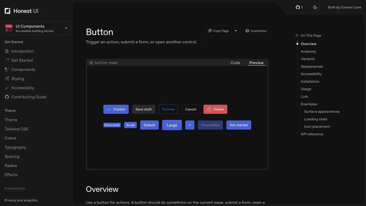
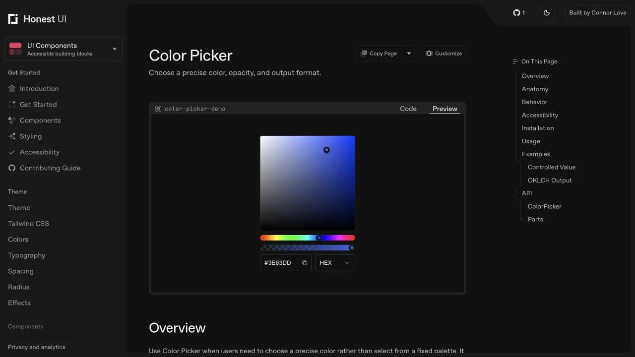
The documentation keeps installation, behavior, accessibility responsibilities, examples, and source code close together.
Case study
HonestUI
What I focused on
For HonestUI, I brought product thinking, interface design, and frontend engineering together around one clear problem.
HonestUI is a source-first React component library for building product interfaces without locking application code behind a package API.
UI components can be installed with the HonestUI CLI or copied manually. Each component page explains its purpose, behavior, states, accessibility responsibilities, installation, usage, examples, and API.
The component collection covers common interface primitives and more involved controls, including forms, dialogs, menus, tables, color picking, and kanban lists. Semantic CSS tokens support themes and project-specific customization.
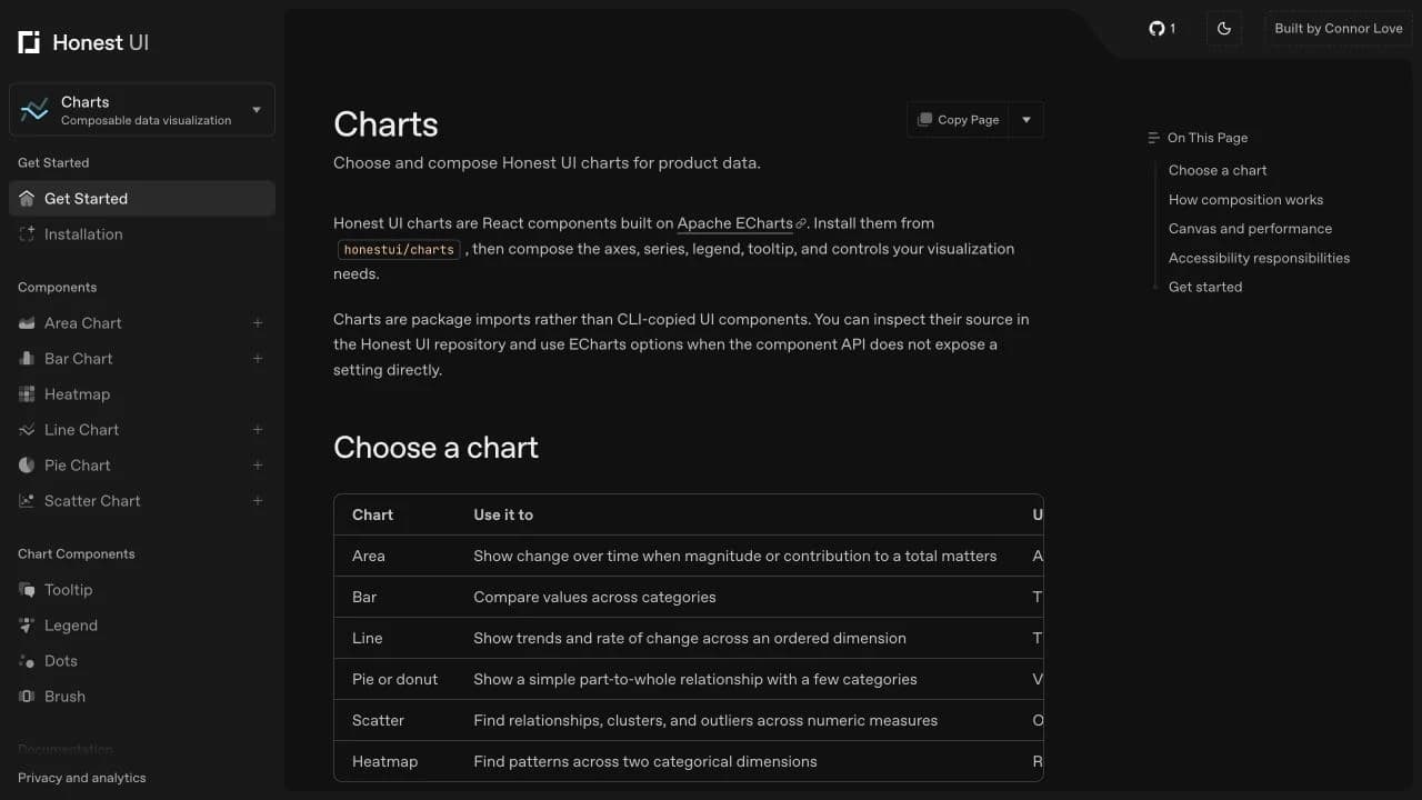
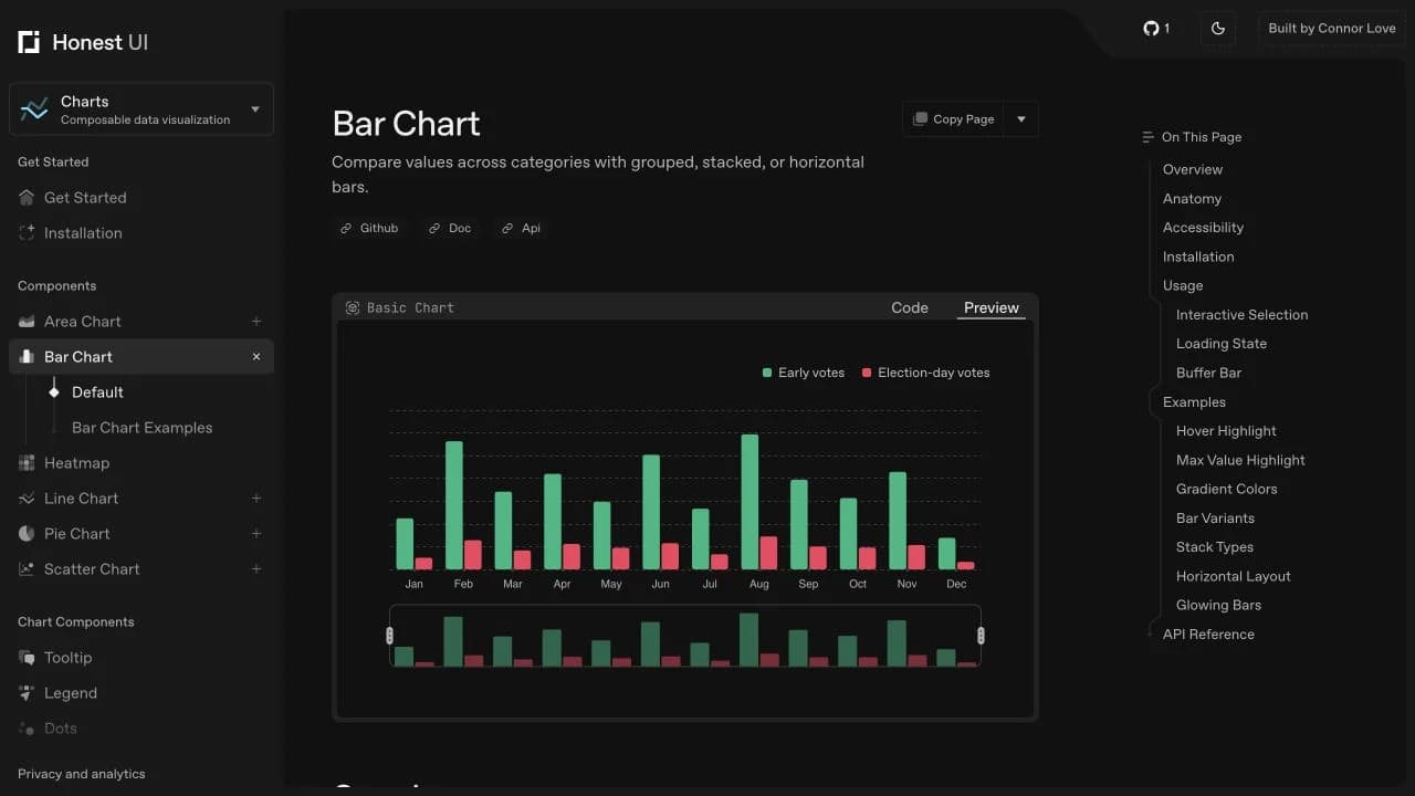
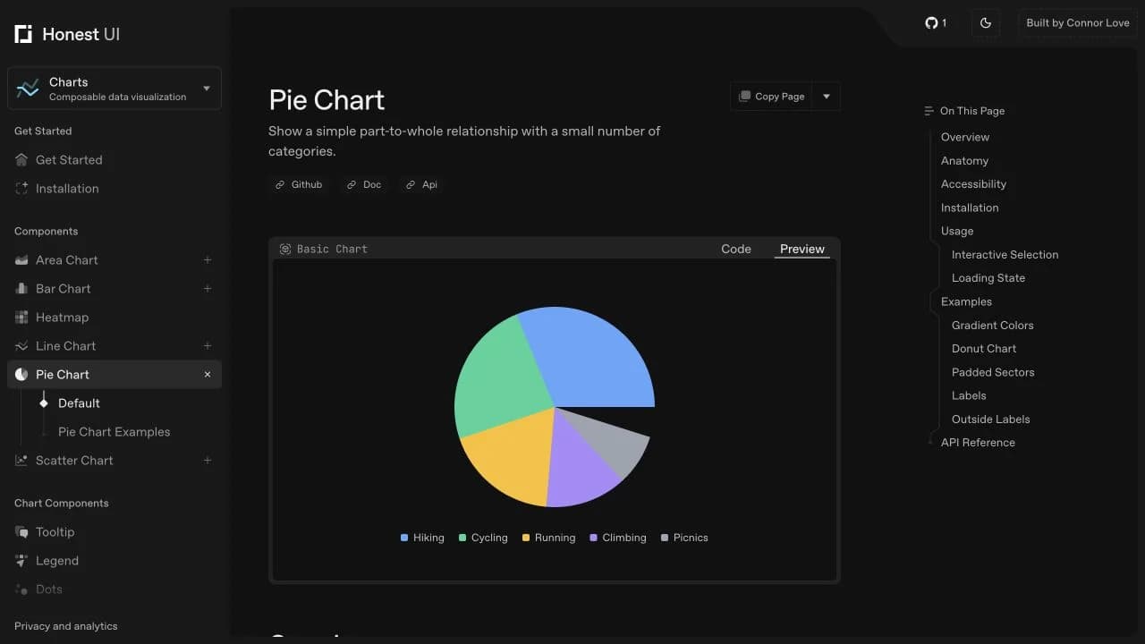
Charts are composable React components built on Apache ECharts. They are imported from honestui/charts and include area, bar, line, pie, scatter, and heatmap options, plus tooltips, legends, dots, and brushes.
HonestUI also includes icons and optional visual effects. The project is MIT licensed, and its source remains available to inspect and adapt.
What I can help with
- Websites and web apps
Custom builds shaped around the product, audience, and way the team needs to work.
- Frontend systems
Responsive layouts, reusable components, semantic HTML, and architecture that is easy to extend.
- Interaction and motion
Purposeful animation, 3D experiences, and polished details that make an interface feel intuitive.
- Product interfaces
Dashboards, learning tools, AI products, workflows, and design systems built for real use.
- Performance and accessibility
Fast, crawlable pages with clear content, structured data, and accessible interactions.