Open ten modern startup websites in separate tabs.
After a few minutes, they begin to blend together.
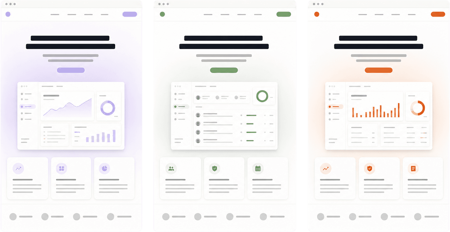
The company names change. The accent colors change. The products may be completely different. But the websites often use the same oversized headline, soft gradient glow, rounded cards, floating dashboard image, customer-logo strip, and carefully animated list of features.
The modern web has never been easier to make look polished.
So why does so much of it feel forgettable?
This is not an argument against good tools, familiar patterns, or clean design. Those things have made the web easier to build and easier to use. It is an argument against letting the tools make the important decisions.
When every team begins with the same components, looks at the same inspiration, and asks the same AI models for a “modern landing page,” visual quality rises—but visual variety can shrink.
The result is a web full of competent pages that could belong to almost anyone.
The sameness is not in your head
You can recognize the current formula before a page finishes loading.
There is usually a navigation bar with a logo on the left and two buttons on the right. The hero has a short label, a very large promise, a paragraph of safe copy, and a primary call to action. Behind it sits a blur of purple, blue, or green. Below it, a row of logos proves that serious companies are already interested.
Then come the cards.
Cards for features. Cards for testimonials. Cards inside larger cards to explain how the product works. The corners are round, the borders are faint, and every surface floats just above the background.
None of these choices is wrong. That is exactly why they spread.
They are flexible, easy to assemble, and unlikely to offend. A founder can buy a template, replace the copy, add a product screenshot, and have a credible website by the end of the day. A developer can install a component library and skip weeks of foundational work. An AI tool can produce the whole structure from a paragraph.
The problem is not that the formula fails.
The problem is that it works well enough for almost everything, so it says very little about anything.
How the web found its default setting
Websites have always copied one another. Trends moved through glossy buttons, textured backgrounds, flat design, full-screen photography, and every other era of the web.
What is different now is the speed and scale of convergence.
A small number of tools can shape thousands of websites at once. Design systems define the spacing. Component libraries define the controls. Templates define the sections. Inspiration galleries define what feels current. Frameworks make certain structures easier than others. AI learns from the output and makes more output that resembles it.
Each layer is useful. Together, they create gravity.
Start with a popular component library and the accessible dialog, menu, and tabs are already solved. That is a real improvement. Start with a template and the responsive grid, type scale, and content width may already be sensible. That is valuable too.
But tools carry assumptions. A component has an intended shape. A template has an intended story. A prompt such as “make this look premium” pulls from a shared visual vocabulary.
The fastest path is usually the path somebody else already cleared.
That is how a style moves from original, to admired, to copied, to expected, to invisible.
Consistency is not the same as sameness
There is an easy way to misunderstand this argument: if familiar design creates sameness, then original design must make everything unfamiliar.
That would be a disaster.
People should not need to solve a puzzle to find the navigation. A button should look usable. A form should explain what went wrong. A shopping cart should behave like a shopping cart.
The consistency and standards heuristic from Nielsen Norman Group explains why. People spend most of their time using products other than yours. They arrive with expectations built elsewhere, and breaking those expectations increases the amount they have to learn.
Familiarity is part of usability.
But familiarity only needs to define the skeleton. It does not need to define the personality.
The UK Government Design Principles make this distinction unusually well: “Be consistent, not uniform.” Shared language and patterns help people understand a service. They are not a straitjacket, and they should change when the context or user need changes.
A good website can use ordinary navigation, readable type, clear buttons, and predictable controls while still feeling like it belongs to one specific product.
Originality does not require confusion.
It requires specificity.
AI raises the floor—and pulls toward the middle
AI can now produce a respectable website before a team has decided what the website should feel like.
That is powerful. It is also backwards.
Generative tools are excellent at supplying plausible structure. Ask for a homepage for an analytics product and you will probably receive a clean hero, a dashboard preview, a feature grid, testimonials, pricing, and a final call to action. The output may be technically sound and visually balanced.
It may also be almost indistinguishable from the output for a recruiting platform, finance tool, or AI writing assistant.
Research in other creative work suggests why this happens. A 2024 experiment published in Science Advances found that access to generative AI ideas improved the average quality of short stories, especially for less creative writers, while making the stories more similar to one another as a group. A study about writing does not prove that every AI-generated website will look alike. But it describes the same tension: individual output can improve while collective variety narrows.
AI is trained to find likely relationships in what already exists. Without strong direction, it gives us the center of the map.
This continues the argument from my first article, “When Code Becomes Cheap, Judgment Becomes Valuable.” When production becomes easier, direction matters more. The valuable question is no longer only “Can we make this?” It is “What should this be, and why should it feel this way?”
Use AI to explore. Use it to prototype, compare directions, test copy, and find weak spots. But do not ask it for a point of view you have not formed.
If the prompt contains no real context, the result has no reason to be specific.
A small experiment: build the default website
The formula becomes easier to see when you can switch it on and off.
The interactive demo below begins with a plain product message. Turn on the familiar “premium SaaS” choices: a gradient glow, rounded feature cards, a floating product window, a logo strip, and vague AI copy.
Watch how quickly the page begins to feel finished—and how little you learn about the fictional product.
Interactive experiment
Build the default website
Add familiar choices to a plain product message. Notice how quickly “polished” appears—and how little the idea changes.
Work planning for small studios
See every project at risk before Monday’s client meeting
Harbor combines deadlines, client feedback, and team capacity in one weekly view.
See what is drifting before it becomes a client surprise.
Plan the week around the people actually available.
Keep approvals next to the work they can block.
The lesson is not that gradients or rounded corners are bad. The lesson is that surface choices cannot carry an idea that was never made specific.
Before styling the page, answer three questions:
- Who is this for, in a real situation?
- What can they do here that they could not do before?
- What should they understand or feel after ten seconds?
If the answers could describe five competitors, the design is not the first problem. The thinking is.
Memorable websites make the form fit the subject
The most useful examples are not websites with the strangest animation or the loudest typography. They are websites whose choices make sense for what they are.
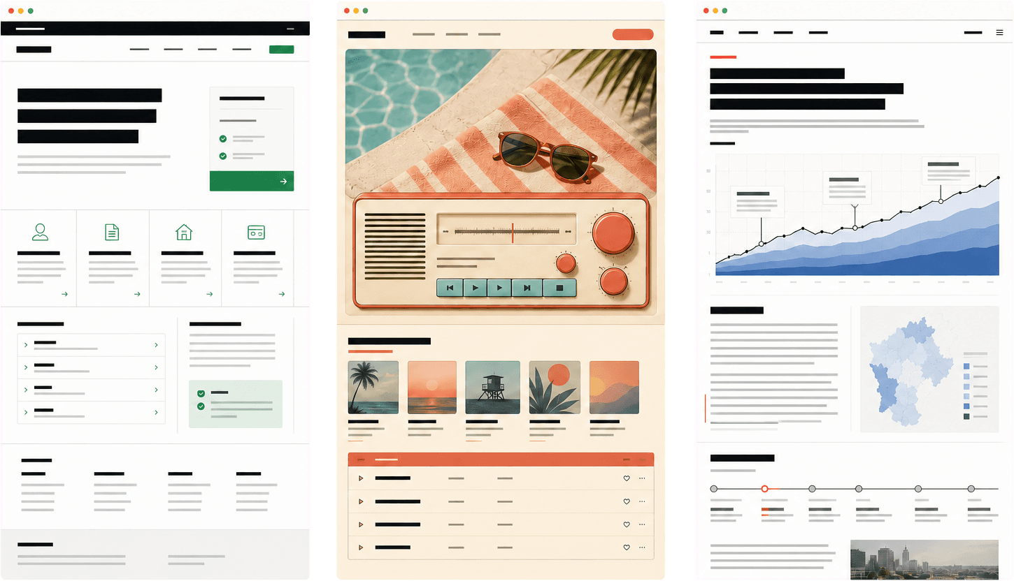
GOV.UK is visually restrained because someone applying for a passport or checking a tax rule needs confidence and clarity, not spectacle. Its identity comes from direct language, disciplined hierarchy, and relentless consistency. It is specific because it understands the stakes.
Poolsuite turns an internet radio player into a sun-faded, retro operating system. The interface, sound, writing, and visual world all support the same playful promise. It is not memorable because retro controls are automatically good. It is memorable because the metaphor belongs to the experience.
The Pudding publishes visual essays in which interaction is part of the explanation. Its team describes choosing topics where visuals inform and entertain. Each story can take a different form because the form follows the question being explored.
Linear is worth studying for a different reason. Its visual language has been widely imitated, but its own design writing keeps returning to the product underneath the style. In “Design is more than code,” co-founder Karri Saarinen argues that design begins with the problem, intent, and product vision—not the act of putting an interface on the screen.
These sites do not share an aesthetic. They share a relationship between purpose and form.
What actually gives a website a point of view
A memorable website rarely depends on one dramatic trick. It usually comes from a series of connected decisions.
The writing sounds like somebody
Replace “unlock powerful insights” with a sentence a customer would actually say. Name the frustration. Use the language of the work. Be willing to exclude the person the product is not for.
Strong writing makes a design more specific before color, type, or motion enters the page.
Delete the logo and ask whether the words still identify the company. If not, the voice is still generic.
The hierarchy reflects a real priority
Many landing pages present every feature with the same card, size, and weight. That is visually tidy, but it avoids making a decision.
If one capability changes the product, give it space. If a detail only supports the main story, make it quiet. If the proof matters more than the promise, move the proof up.
Hierarchy is an argument about importance.
Typography does more than signal “modern”
Typography can feel technical, editorial, institutional, warm, urgent, or calm. It can create density for expert tools or openness for a considered story.
Choosing the same neutral sans serif as everyone else may be correct. But it should be a decision, not a default you forgot to question.
Imagery comes from the product's world
Generic 3D shapes and abstract gradients are easy to place because they do not say much. Specific imagery is harder. It may require product photography, diagrams, customer artifacts, illustration, data, or a new visual system.
That effort is often where identity appears.
Show the material of the work, not a decoration around it.
Motion explains something
Movement can show cause and effect, preserve context, reveal hierarchy, or make a direct-manipulation interface feel responsive. It can also delay text that was already ready to read.
Ask what a motion teaches the user. If the answer is only “this feels premium,” try removing it.
Purposeful motion also respects the person on the other side of the screen. The W3C documents how prefers-reduced-motion can suppress non-essential animation for people who experience distraction, dizziness, or nausea from it. Supporting that preference is not a loss of creativity. It is part of designing for reality.
Restraint leaves room for the idea
AI and component libraries make it easy to add another section. Product judgment often means knowing when not to.
Not every idea needs a card. Not every card needs an icon. Not every transition needs a spring. Not every page needs to demonstrate the full range of the stack.
When everything asks for attention, the product loses it.
A better way to use the same tools
The answer is not to abandon templates, design systems, or AI. Shared tools are one of the reasons small teams can build excellent products.
Use them for the parts that should be shared.
Let a tested component handle keyboard behavior. Let the framework handle routing. Let the design system create internal consistency. Let AI build the first version, generate edge cases, or translate a clear direction into working code.
Then spend human attention where context matters.
Write a one-sentence point of view before opening the design tool. Collect references from outside your category. Start with real content instead of placeholder copy. Design one important moment before assembling a whole page. Test the interface without animation. Ask why each section exists.
A useful process looks like this:
Understand the situation. Choose a point of view. Build the plain version. Add character where it carries meaning. Test it with real people. Remove what does not help.
The order matters.
If character comes before clarity, the website becomes a costume. If clarity comes first and character never arrives, it becomes interchangeable. The work is holding both.
Five questions before the page ships
Before calling a website finished, open it next to three competitors and ask:
- If the logo disappeared, could someone still tell which company made this?
- Which choice on the page comes directly from the product, audience, or business?
- What would remain if the gradients, cards, and animation disappeared?
- Is any interaction unusual because it helps, or only because it is unusual?
- What did we remove to make the main idea clearer?
These questions do not guarantee originality. They expose where intention is missing.
The web does not need more novelty. It needs more specificity
The problem is not that websites use the same tools.
Painters share brushes. Musicians share instruments. Developers have always shared code.
The problem begins when the tool supplies the point of view.
As AI and reusable systems make polished websites easier to produce, visual quality becomes the starting line rather than the finish line. The developers and designers who stand out will not simply build faster. They will know how to make something feel clear, intentional, and true to the thing it represents.
That may produce a bold, strange website. It may produce a quiet page with almost nothing on it. Originality is not a style that can be pasted on at the end.
It is what happens when enough decisions belong to the problem.
The web does not need difference for difference's sake.
It needs more experiences that could only have been made for the people, products, and ideas they serve.